Mapanare.us Constantly.Consuming.Culture.
  • Art
  • Interviews

LICHT FELD At Context 2012 Showing New Artists Susannah Martin And Nimai Kesten

12/1/2013

0 Comments

 
Picture
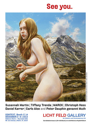
LICHT FELD, exhibiting at Context/Art Miami 2013, is always a highlight in Miami. The Basel, Switzerland-based gallery and yearly art show is run by artist Fredy Hadorn. This year LICHT FELD has, a couple new artists: Susannah Martin and Nimai Kesten.

Hadorn says he first saw Martin’s work on the internet. He was particularly impressed with the piece, The Lady.

“The nudity in nature easily frightened and intimate in their attitude and the look in his eyes. A very nice example of the beauty of nature and the sensitive female,” says Hadorn. “It is also a nice example in the tradition of nude painting--the human in its purest form. That was about June 2014.”

Hadorn contacted Martin and asked f she wanted to participate in LICHT FELD 2013, Biennial Basel. The idea behind the exhibit was the placement of a bunker in the center of a large exhibit hall—representing protection from war and violence and providing a hiding place. It was a refuge for women from “the kinky men who need to mistreat women. “

“As juxtaposition I wanted to show the record of Susannah Martin. She agreed and so it came to the first cooperation.” says Hadorn.

Kesten was introduced to Hadorn and LICHT FELD by former Gallerist Terrance Sanders from Los Angeles (Sanders is also publisher of Art Voices Magazine). Hadorn had never met Kesten and made the decision to include his work after viewing it online. Sanders felt the work, Crucifix, was a perfect criticism of political policies and religion in the USA.

“So I decided to show this work in Miami and to use the opportunity to meet the artists in person and possibly to discuss further cooperation." says Hadorn.

Other LICHT FELD artists include: Carlo Aloe, MARCK, Peter Dauphin genannt Muth, Christoh Hess, Tiffany Trenda and Daniel Karrer. See also LICHT FIELD catalog HERE.

Picture
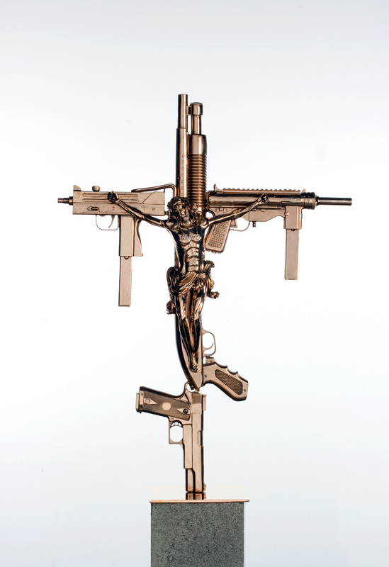
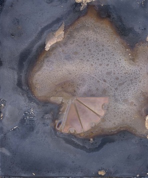
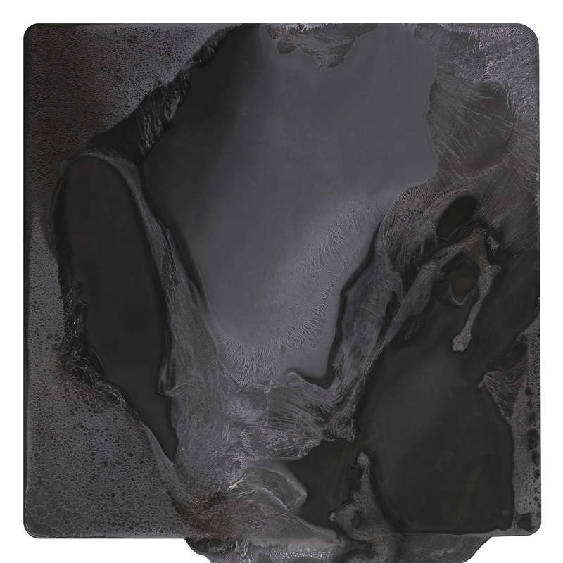
Crucifix by Nimai Kesten
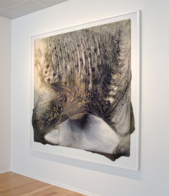
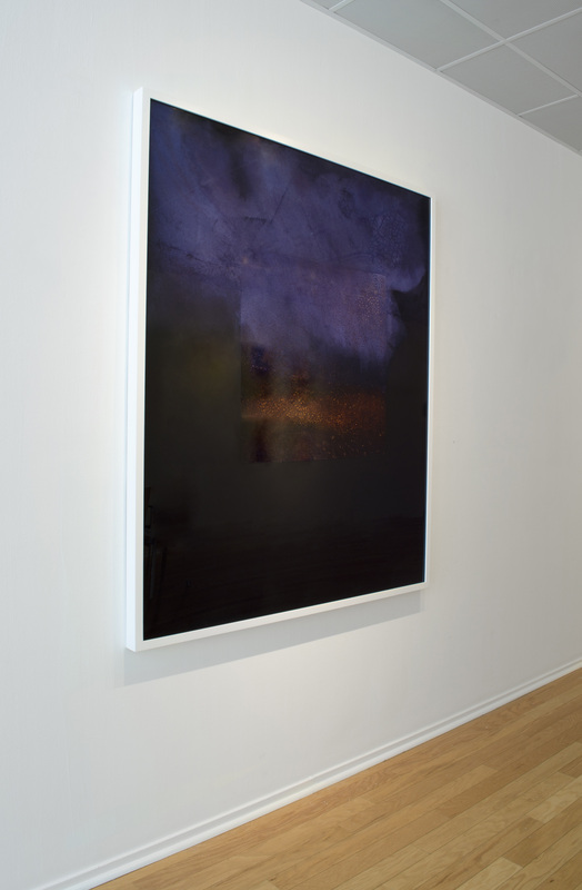
Susannah Martin

Martin says her work is of real people, real places despite how they may seem somehow dream-like.

“I think that what makes them feel like a ”beautiful dream" is that they speak to our dreams or rather our collective subconscious about a state that we have lost and on some level wish to return to.   They are wish-fulfillment dreams.  Originally I began to paint this subject because I wanted to react to the very traditional genre of "nude in landscape" painting and try to contemporize it,” says Martin. “I discovered quickly that there was an intense absurdity to painting a nude in a landscape at this point in time when mans´ relationship to nature is dislocated at best.  The absurdity of our dislocation has become the actual subject of my work.”

There is no idealization in her work. She says she makes the landscape as important as the figure it but says that distract from the beauty of the figure.

“ On the contrary, at least as far as I am concerned, the figure gains strength from becoming one with the landscape rather than isolating it as academic painting dictates, “ she says. “ I think that we can apply that observation to our general state of being and will find the same to be true.  That is the socio-political side to it; I want us to stop seeing ourselves as separate and above nature. “

When it comes to HOW Martin does the art she begins with her models and a rough idea.

“Then comes the day, after considerable organization and location scouting, when we go outside and get naked! Actually they get naked and I get behind the camera and give direction.  What happens during the course of the photo shooting determines the next step.  It is never what you expected and it is always wonderful and inspirational. Once I have gathered this material, analog and digital, I begin to spin, “says Martin. “The reaction of the models to being naked in open nature, that very honest experience, is what creates the story.  I spend many other hours photographing landscape on its own.  Sometimes the action takes place where the people actually stood, often it does not.  Once I have the concept, then I plan the composition rigorously before beginning to paint.”

 What reaction does Martin hope you, the audience, have to her work?

“Well, I would be very happy to hear that it inspired someone to take off their clothes outside and jump in a stream! Perhaps re-establish a little contact with the elements and feel truly alive for a moment,” says Martin. “Other than that, I would like them to think about what we all are, without our clothes, without all of our stuff, without all of our addictions.  So really I am hoping to take the painted nude away from its´ traditional role and use it as a type of mirror in which we can reflect upon our position as part of the whole.”

Picture
Kesten’s sculptures juxtapose religion symbols and implements of violence.  The crucifix is often a center piece in his work. Why?

“I create a visual language within my work that explores the themes of corrupted faith and religious wars. The doves represent the children who are condemned and silenced within the confines of religion. Doves are the iconic symbol of peace,” he says. “As a young man I would visit my grandmother, an Italian immigrant with solid catholic beliefs. All throughout her house were displays of holy water, crucifixes, and pictures of the pope that left a lasting impression on me. My mother on the other hand rejected her catholic upbringing and embraced eastern philosophy, namely Krishna consciousness otherwise known as ISKCON or the Hare Krishna movement. Specifically, these contradictions are continuously explored throughout my work.”

 Kesten began as a street artist before taking on his new style and subject matter but those origins remain with him and his work.

“Growing up in New York City as downtown kid was extremely influential in my growth as a contemporary artist. Hip-hop, graffiti, and fashion in the late 80’s and early 90’s were highly influential to my process,” says Kesten. “My current work has moved away from pop culture and evolved into pieces that explore honest themes that deal with humanity and the human condition.”

 Kesten is trying to, first, make work that has an interesting look but there is more to it than simply this.

“My aim is to create work that is challenging and aesthetically pleasing. I want the viewer to embrace my visual dialogue,” he says. “Once analyzed I hope the viewer is able to internalize, question and or discover his or her own beliefs, morals and ethics.”

0 Comments

Ruth Pastine Showing New Work At Miami Project Via Brian Gross Fine Art

12/1/2013

0 Comments

 
PictureConquer Surrender 1–3 (Red Blue),

Double Primary Red Blue Series, 2010

Ruth Pastine, a native of New York now living in California, is set to show new work at Miami Project 2013 via Brian Gross Fine Art. The fair is in its second year.

Pastine often uses what appears to be a single color that gradually changes across a painting.

“
My work is focused on the phenomenological investigation of color and its optical invocation of temperature, light, and spatial interplay. My painting process explores the perceptual interaction of saturated and nuanced color relationships that investigate the dialogue between object, presence, and phenomena.  I work with subtle color, that which is difficult not just to describe but to see, as a vehicle to transcend preconceptions about perception to redefine the perceptual field,” says Pastine. “Color is a vehicle to engage the ever-present moment of discovery through my process, what Hegel called the 'universality' of the here-and-now, and avail this opportunity to the viewer.  Color is present tense, as it exists in the moment of perception, which has the potential to free us from the burden of what we think we know to be available to experience the unknown.”

Pastine also creates installations with series of her work.  There is something added to each piece as it is shown next to her other paintings. Her works are often similar; they are part of a series (she uses “seriality” in her body of work”).

“My process is invested in the methodological repetition of working serially. Seriality is a means to exhaust and expand upon the set limitations of a given body of work.  It's fascinating that the finite color systems and structural parameters of one series become the limitless potential to advance new work and open doors to a completely different series with new defining parameters” she says. “The works in a given series have an exclusive dialogue and relationship to one another through color, structure, and spatial interplay, but stand as individual pieces afforded by the finitude of the singular canvas and the self-referentiality of the square and the rectangle.  I also work on multiple panel paintings: diptychs, triptychs, and quartets that are sited as fixed installations, and I have created site-specific installations that speak to the dynamics of the architecture and social context. These pieces present complex perceptual experiences and relationships between the paintings and the space they occupy.”

Find out more about Ruth Pastine HERE
Picture
Flash 3 (Blue), Primary Color Series, 2011
Pastine also creates works on paper that are smaller in scale and are more “immediate” when it comes to the creative process.

“Although both my oil-on-canvas paintings and pastel works on paper are built up with numerous layers, the dry pastel pigment medium demands a completely different application, and reintroduced perceptual edges between hue, value, and saturation separations in the work, due to the actual limitations of the dry pigments,” says Pastine. “Limitations present the opportunity to advance my process.  In the new paintings the perceptual edges between color, value, and saturation heighten the dialectical process and the complex interplay between materiality and immateriality, presence and absence, light and space, surface and depth, the tangible and the ineffable.  I embrace limitations as the vehicle to transcend those same limitations.  Paradoxically, it presents the finite and the infinite simultaneously.”

What is it Pastine wants her audience (i.e. YOU) to get out of her work?

“My hope is that the work shares the ever-present moment of discovery with the viewer, the immediacy of my process, and the anxiety and awe that engages me in the studio, what Kant and Hegel refer to as the sublime, which requires the presence of something terrifying and beautiful. “ she says.

Pastine is bringing several new paintings and pastel works on paper to Miami. The works are from her Interplay series, 2013.  These new works were just completed.

“… it's always deeply gratifying to share the new work with a new audience and have it dynamically in play.” says Pastine.

0 Comments

Renee McGinnis Discusses Her Work Coming to Context (Art Miami) 2013 Via Packer Schopf Gallery (Chicago)

11/29/2013

1 Comment

 
PictureSS Narwhal
Renee McGinnis is one of the artists coming to Context/Art Miami 2013 with Chicago’s Packer Schopf Gallery. Her recent works juxtapose images of natural beauty with decaying (but still oddly beautiful) manmade structures, be the buildings or, in her more recent work, ocean liners.  She creates this work out of her love and concern for the earth and the delicate systems that sustain all life.  Yet why ocean liners specifically?

“With these stricken liners I hope to distill all I know of my species and the delicate and fallible systems that sustain us down to a gentle yet startling beauty. I have commissioned these liners as a metaphor for the earth and human activity to create a permanent human record of us,” she says. “These rusting, listing yet still beautiful vessels were filled with every luxury yet finite in resources adrift in an inhospitable cosmos bordered with beauty. They act upon the viewer like a Chaplin film or an opera. On one hand they're lovely and heroic, on the other doomed and sorrowful, each emotion enhancing the other.”

There is something sinister in the reality of the modern ocean liner: they pollute, they are homes to conspicuous consumption and throw away culture. But McGinnis’ liners are of a bygone, more genteel era but an era where all the excesses were still present. In the doomed beauty of these ships McGinnis wants us to find that metaphor of the earth but also something else—a visual caution.

“I hope they serve as beautiful warnings to us all, speaking visually about humanity, triumph, and tragedy and how these conditions co-exist.” says McGinnis.

McGinnis’ family history also comes into play. Her ancestors, from Norway, built luxury yachts for European aristocracy until the advent of steel hull construction.

“The 20th century luxury liner represents a benchmark of technology, human arrogance and great aesthetic attention. I also draw upon the sweetness and delicate imagery of fine china or souvenir collector plates that commemorated the launching of these great vessels,” she says.  “The image of impending disaster and human suffering is bounded by the security and beauty of the embracing border imagery that contains everything from kelp and roses to opals and all manner of sea creatures. One MUST get very close to these in the gallery to see the most important content.”

McGinnis’ work is also inspired by Caspar David Friedrich and his work “Sea of Ice.” It is her hope to “bridge the era of great paint handling with that of post modern expectation.”


See More Work By Renee McGinnis HERE
Picture
The Asphyxiation of the USS Princess
McGinnis has an academic background in Sociology and Anthropology and says her advanced studies in these disciplines inform everything she does.

“In order to record human tendencies as an art form I must be able to observe our species with a schooled mind.” she says.

Her work is, indeed, a record of humanity and its relation to the rest of the natural world. They are more than aesthetically beautiful—they are a profound commentary on human beings, our impermanence and our often deleterious effect on the natural world.

“The exhibition resembles a row of portholes, each a microcosm of its own drama and beauty” says McGinnis. “One may wonder whether they are somewhere within a ship looking out or passing the vessel looking in.”

Her work is not all decaying ocean liners and dilapidated terrestrial structures. Some pieces use unconventional items—lemon rinds or condoms

“My works are always an attempt to stimulate and activate the intellectual overdrive I feel we all possess. My earlier work such as International Lemons Aid reminds us human hardship brought about by overpopulation,” says McGinnis. “The dried lemons are painted every color of human skin tone representing a female role in global family planning. Halved lemons were also an ancient form of birth control [highly acidic cervical cap] the found pearls fill in the gaps between the gold condoms and gold leafed diaphragms. It all celebrates being mindful of our resources and the choices we make as a species.”

The SS Narwhal and The Asphyxiation of the USS Princess are showing at Art Miami.

“The USS Princess is the first in this series. I painted a great decaying luxury liner crashing through dangerous seas with part of her lower bow missing.  Surrounding her in a carefully painted border of splashy water shapes are opals, pearls and aquamarine stones,” she says. “The opals are water trapped in mineral and of course these ships are mineral trapped in water. As the splashy shapes travel around the border they drop into one of the Princess' funnels, symbolizing her eminent demise though a beautiful one.”

Both paintings are oil on birch board on panel.

“The NARWHAL has scarring on her hull, as a whale has on its body. Every bolt and rivet is visible and the mast has fallen forward with twisted rigging suggesting the long twisted tusk of the Narwhal whale. The bow figure is a female pelvis [another fragile vessel that human life depends upon], the ribs opening up and becoming wings,” says McGinnis. “The border, a sinewy flourish of blue flow china shapes with vases, more fragile vessels. Surrounding the storm clouds an organic spot varnish. This changes as one moves their eyes across the piece.”

Picture
Battersea Power Palace VI

Not at Context...shown as an example.

1 Comment

Teo Gonzalez, From Spain And Residing In Brooklyn Showing Work At Miami Project 2013 Via Brian Gross Fine Art

11/27/2013

0 Comments

 
PictureUntitled #651
Teo Gonzalez, from Spain currently living in Brooklyn, is an artist who produces wonderful, provocative non-representational pieces. They are also pieces that, even more than is the norm do not seem to translate from reality into a photo and onto a website. His work is compelling on the page or online but it is much more so in person. He is showing work at Miami Project (December 3 to 8, 2013) via Brian Gross Fine Art at Miami Project (Booth 803).

How does an artist deal with this in an age where so much art is seen online?  Gonzalez just does his work and doesn’t worry about it.

“That is the nature of the work. I could always have done a type of work that looked great in photographs, but ultimately what is important is that you are true to yourself so that your work ends up in the hands of someone who will appreciate it, which pretty much means someone who will not rule it out based on an image of it,” he says. “So, yes, making shows is very important to me, but they are very important to every other visual artist because all of us need our work to be seen in person to really be appreciated.”

Gonzalez is correct that any art needs to be seen in person to be truly appreciated.  But, nonetheless, art enthusiasts and collectors should make sure to see his work in person. The depth of his work and its appeal truly need to be seen in person. You can get an idea and feel via photos and the artist’s description but be sure to see these pieces.  He uses canvas on board for his latest pieces—which are informed in part by his background in drawing.

“I use acrylic paint because it dries quickly. My work has a lot to do with drawing, and acrylic paint feels as immediate as a pencil to me.  The canvas over board arrangement started because I was placing thousands and thousands of drops of diluted acrylic enamel on my paintings,” he says. “And I needed a surface that I could set horizontally and would not bow down so that those drops would dry without running into each other.  A board under the canvas seemed to be the way to go.”  

Picture
King Ashurbanipal (study 3)
What does the artist want, the viewer, the prospective collector, to take from his work?

“I think of a my work as a vehicle to communicate something that can only be expressed with images --in the same way that writing uses words or music uses sound. Therefore, the message in my paintings can't be put into words,” Gonzalez says. “But it can be understood and felt. What I want people to understand o feel when they see them is the same as I do. I hope that my work is intriguing to viewers and that it somehow compels them to look at it again.”

Gonzalez’ earlier work was, in some respects, self-referential. These days he moves beyond himself in what he creates.

“I started doing this work to get away from what I was doing before.  I needed to put some distance between my work and myself, and I wanted to do a type of work that wasn't a reflection of me, my ideas, likes or dislikes.  Looking for ways to avoid those issues, I started to work with geometry and later with naturally occurring events,” he says. “I appreciated very much how impersonal both could be, how they could emphasize reason rather emotion and yet make an impact at a human level. A little while later they fused into the drop work and the rest has been its evolution.  With respect to my influences, first and foremost is my teacher in Spain, Jordi Teixidor, who taught me to understand what I was doing.  Among the --let's call them-- classic artists, I was very impressed by Ad Reinhardt. I loved his endurance and tenacity to take things wherever they had to be.”

This year Gonzalez is bringing pieces from his last series—images with a lot of contrast between background and foreground. He is one of a number of artists being shown by Brian Gross Fine Art.

0 Comments

Brittany Nelson Showing Beautiful Pieces--Created With A Little Help From Chemistry--At Art Miami Via David Klein Gallery

11/27/2013

0 Comments

 
PictureTest
Brittany Nelson, an artist originally from Great Falls, Montana, often uses non-traditional methods and materials in her work. Of course, there is a long tradition of using non-traditional materials in art so perhaps she IS being traditional. She will be showing her work via David Klein Gallery at Art Miami 2013 December 3-8 in Booth A-5. You can check out their exhibition catalog HERE.

Nelson’s work begins in the dark room and has, at its roots, experimentation with the chemistry of photography.

“The work is initially created with analog materials in the darkroom. I've been experimented for several years with a chemistry combination that oxidizes the silver in black and white darkroom papers” says Nelson. “It was initially used in the late 19th century as a reversal process for film negatives. I've been cataloguing all the variables capable in this technique over several hundred experiments/prints.”

She is interested in the notion that in order to create these images she has to destroy the function and most costly component of the material—the silver.

“Particularly since silver is at its highest cost and the photographic material is becoming more costly and precious. The original prints are toxic, and constantly shift in color and appearance. I scan them at very high resolutions and the finished piece is a large-scale chromogenic print,” she says. “This functions to leave behind the nostalgia of the darkroom by putting the pieces into a tableau photographic dialogue, and also the shift in scale to allow the viewer to examine and experience the material as not previously seen before. “

Nelson is interested in creating a “formal” experience for the viewer. She wants them to stand in front of her pieces and have a visceral reaction to the relationship between body, form, color and texture.

“And by doing this with purely photographic processes and material. I'm also a fan of the idea of mystery in a piece, that the viewer is not sure what it is they are looking or how it was made,” she says. “The only clue is that the tag lists it as a c-print, placing into photography but they are no longer looking into an image space captured by the camera but instead examining the surface of the material.”


Visit Brittany Nelson's Website HERE
Picture
Mordancage 2
Over time Nelson has removed representational images from her work (“representational images” are things; a person, a chair anything you might see in the real world). She also stopped taking photographs.

“ (I) instead focused on finding any integrity the material in experimental or alternative photography possess on their own. Paired with imagery, they've fallen into a point of crisis where they've become no more than an analog Photoshop filter,” she says. “I find the history and possibility of alternative process amazing, but find it odd that the capabilities have never been fully explored outside of their traditional use. I'm very interested in the idea of misusing materials but also removing the romanticism and nostalgia surrounding them and replacing it with very calculated chemistry experiments.”

When asked about her “artistic future” Nelson makes you want to share a studio with her (well, except for the “toxic chemical” part).

“My immediate artistic future involves a Dickie's jump suit, a full face respirator, some toxic chemistry and a one- person dance party in my lab. Slightly more long term plans include several large pieces exhibited at Art Miami with David Klein Gallery (Detroit),” says Nelson. ”And also the showing of a large 6x6 ft image during Frieze New York this May. I'm currently still working on the long term experiments re-purposing and destroying analog based materials as well as many side projects that are still in development stages. Extended long term plans are always the same: don't die and make as much work as possible.”

Nelson was in Miami with David Klein Gallery last year as well and found it to be a rewarding experience.

“Art Week is crazy. As an artist I think it is invaluable to be able to see so much work, from so many well established galleries around the world all in one spot. It's overwhelming, but I love overwhelming,” says Nelson. “It's an exhausting assault on the senses. From a non artist perspective Miami goes all out on this event. There are amazing free concerts, events and parties everywhere. It's thrilling how much the city embraces the art community.”

0 Comments

    RSS Feed

    Interviews
    This section is interviews with artists, musicians, writers and anyone else we think is interesting.

    Categories

    All
    Art
    Art Basel 2012 Previews
    Art Basel 2015 Previews
    Art Basel 2016 Previews
    Art Miami
    Art Week Miami 2013
    Art Week Miami 2014 Previews
    Books
    Design
    Films
    Graphic Novels
    Interviews
    Miami Art Week 2017
    Miami Art Week 2018
    Miami Art Week 2021
    Miami Art Week 2022
    Music
    PFAF 2019
    Photography
    Previews
    Superfine!

    RSS Feed

    Archives

    November 2022
    November 2021
    November 2019
    March 2019
    December 2018
    November 2018
    October 2018
    December 2017
    November 2017
    March 2017
    November 2016
    October 2016
    September 2016
    August 2016
    May 2016
    February 2016
    January 2016
    November 2015
    October 2015
    August 2015
    May 2015
    April 2015
    December 2014
    November 2014
    May 2014
    April 2014
    March 2014
    February 2014
    December 2013
    November 2013
    October 2013
    September 2013
    July 2013
    June 2013
    May 2013
    March 2013
    December 2012
    November 2012
    August 2012
    June 2012
    May 2012
    April 2012
    March 2012
    November 2011
    October 2011
    September 2011
    August 2011
    July 2011
    May 2011
    April 2011
    March 2011
    December 2010
    November 2010
    September 2010
    August 2010
    July 2010
    June 2010
    April 2010